Flexible CSS rule-sets to keep your images within their parent element
Since an image is worth a thousand words, we use images in your webpage to express complex ideas succinctly.
By default, if we do not specify any dimensions for an image, most browsers will show the image according to its actual size. In this situation, an image will appear to spill over the boundaries of its parent element if it is bigger.
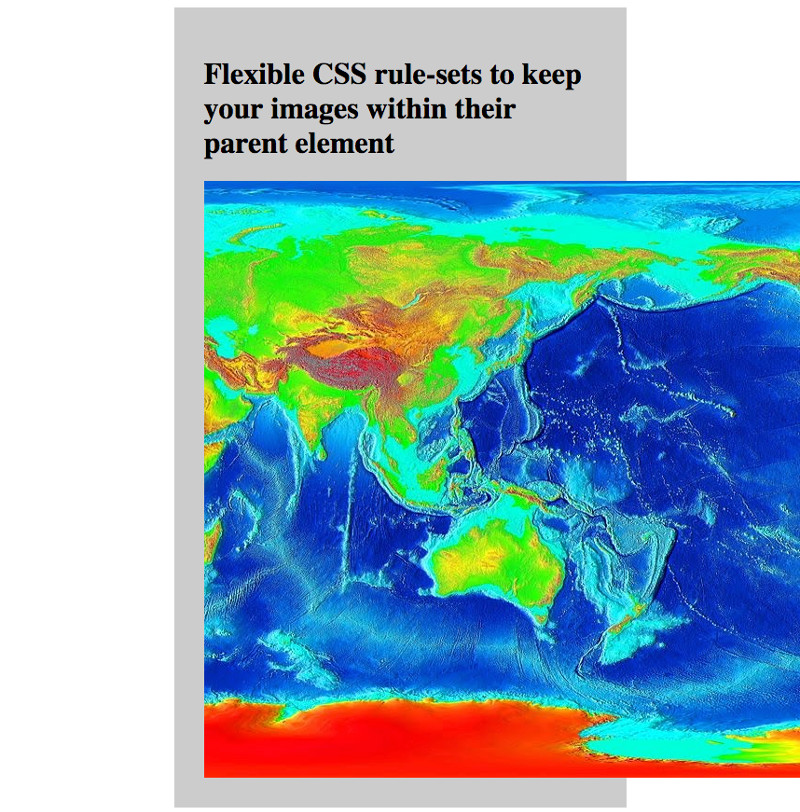
For example, the following screenshot shows the image at https://commons.wikimedia.org/wiki/File:LARGE_elevation.jpg spilling over its parent element:
One way to prevent a larger image from going beyond the boundaries of its parent element is to give a standard width to all images. However, if the actual width of an image is smaller than the given width, the image will be stretched:
This post shows the CSS rule-sets that you can use for flexibly keeping images within their parent element.
Example CSS rule-sets and HTML codes that keep an image within its parent element
When an image is smaller that the parent element, we want the browser to show the image in its actual dimensions instead of stretching to fill the parent element.
On the other hand, if an image is too large for the parent element, we want the browser to show the image in a dimension that nicely fit the parent element.
With this purpose in mind, we can use the max-width CSS property to indicate the maximum size that an image can be displayed:
img {
    max-width: 100%;
}
In order to see the effect of the max-width CSS property on images, we can create an example for flexibly keeping an image within its parent element:
<html>
  <head>
    <title>Flexible CSS rule-sets to keep your images within their parent element</title>
    <style>
      img {
        max-width: 100%;
      }
    	.container {
    		background-color: #CCC;
    		padding: 2rem;
    		margin: auto;
    		width: 50%;
    	}
    </style>
  </head>
  <body>
    <div class="container">
    	<h1>Flexible CSS rule-sets to keep your images within their parent element</h1>
    	<img src="https://sites.google.com/site/tcperpetual/bigimage/1280px-LARGE_elevation.jpg"/>
    </div>
  </body>
</html>
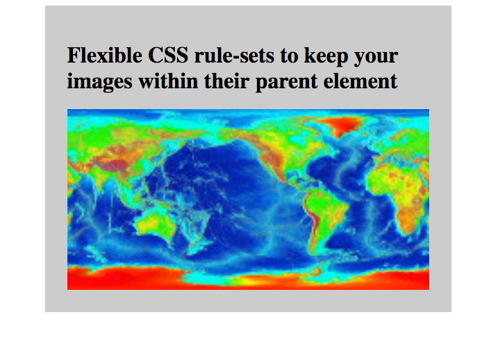
When rendered by a browser, the above codes will look like the following:
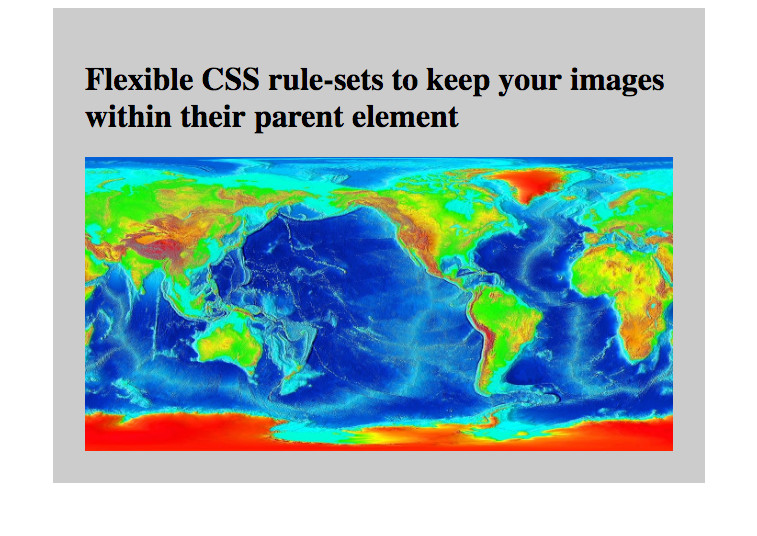
You can try to resize your browser to see if the image is always displayed within the parent element.
In addition, you can try to change the image to one with a smaller width than the parent element. In this situation, the image will be displayed in its actual dimensions.
 Share
Share
 Tweet
Tweet
 Share
Share
 Save
Save